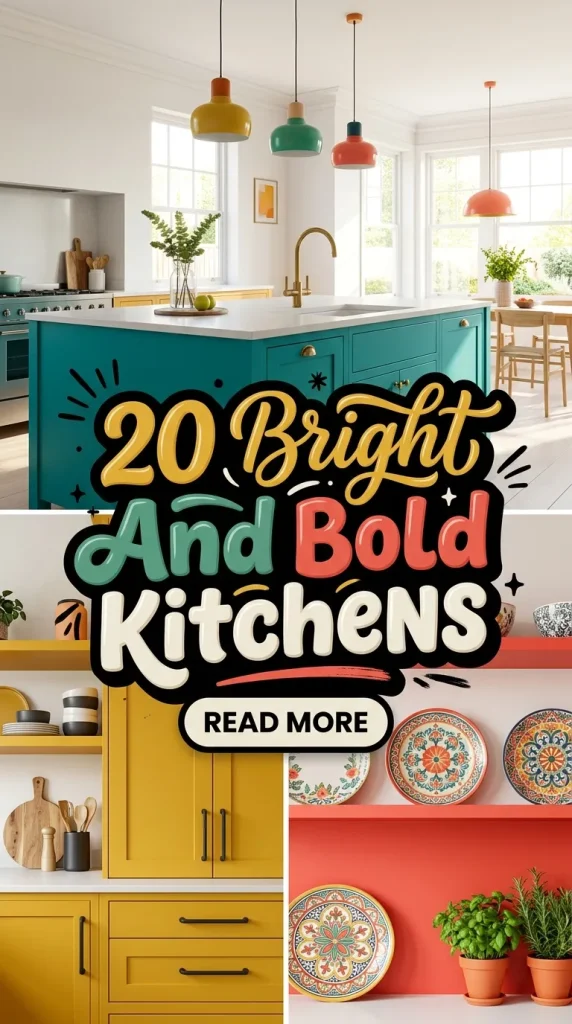
Designing a bright and bold kitchen is an invitation to celebrate color, personality, and fearless style. These kitchens are not just functional workspaces—they’re joyful stages where morning coffee, family dinners, and creative cooking happen against a backdrop of confident design. Below are 20 Pinterest‑friendly ideas, each presented as a clear design direction with practical tips, material suggestions, lighting strategies, and styling notes so you can bring a vibrant, bold kitchen to life no matter the size or budget.
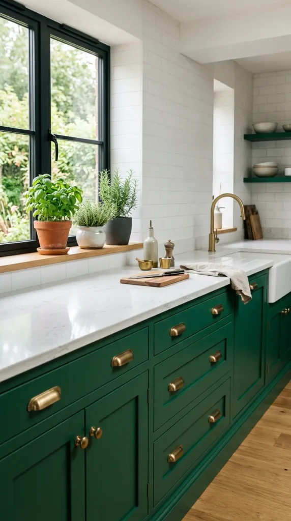
1. Jewel‑Tone Cabinets with Crisp White Counters
Jewel tones—emerald, sapphire, ruby, and amethyst—bring instant drama and richness. Pairing deep, saturated cabinetry with crisp white countertops and backsplashes creates a high‑contrast, modern look that still feels clean and approachable.
Why it works The saturated cabinet color becomes the room’s focal point while white surfaces keep the space bright and reflective. The contrast reads luxurious without feeling heavy.
How to implement
- Paint lower cabinets in a jewel tone and keep upper cabinets white or glass‑fronted to maintain light.
- Choose quartz or honed marble countertops in white with subtle veining for durability and brightness.
- Add brass or matte black hardware to punctuate the color and add a designer touch.
Styling tips
- Use warm under‑cabinet lighting to make the jewel tones glow.
- Keep accessories minimal and neutral—white ceramics, wooden cutting boards—to let the cabinetry shine.
- Introduce a small accent rug or bar stools in a complementary color for cohesion.
Mood This approach feels bold and refined—perfect for homeowners who want color without chaos.
2. Two‑Tone Cabinets: Playful Contrast
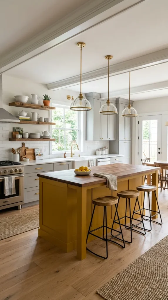
Two‑tone cabinetry is a clever way to introduce bold color without overwhelming the room. Use a bright hue on the island and a neutral or softer tone on perimeter cabinets for balance.
Why it works The island becomes a statement piece—almost like furniture—while the surrounding cabinetry recedes, keeping the kitchen grounded.
How to implement
- Choose a saturated color (mustard yellow, teal, coral) for the island and a soft gray, cream, or navy for the perimeter.
- Use consistent hardware finishes to tie both tones together.
- Consider open shelving on one wall to break up color blocks and display curated items.
Styling tips
- Paint the island’s end panels and bar fronts to make it feel like a freestanding piece.
- Add pendant lights above the island that echo the accent color or metal finish.
- Keep countertops neutral and add a patterned runner to introduce texture.
Mood Two‑tone kitchens feel playful, layered, and intentionally designed—ideal for social cooking and entertaining.
3. Bold Backsplash as the Star
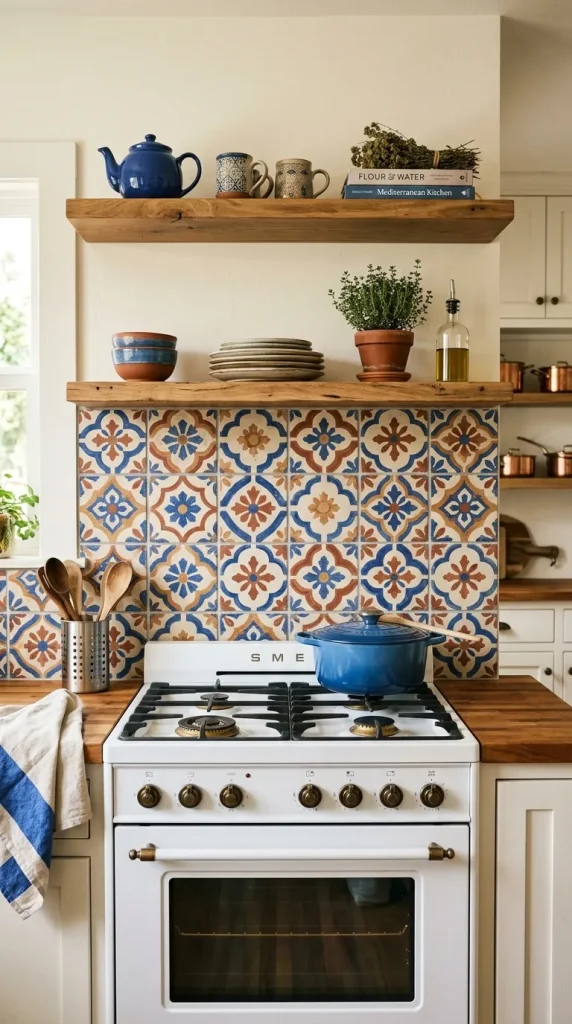
If you’re hesitant to commit to colorful cabinets, a bold backsplash can deliver maximum impact with minimal permanence. Think large‑format patterned tiles, hand‑painted ceramics, or a vivid glass mosaic.
Why it works A striking backsplash draws the eye and becomes the kitchen’s visual anchor while leaving other elements neutral and flexible.
How to implement
- Install a full‑height backsplash behind the range and sink for dramatic effect.
- Choose tiles with glossy finishes to reflect light and enhance color saturation.
- Pair with simple cabinetry and countertops to avoid visual competition.
Styling tips
- Coordinate grout color to either blend for a seamless look or contrast for a graphic effect.
- Use open shelving to frame the backsplash and display complementary dishware.
- Add small metallic accents—trim, shelf brackets—to pick up tones in the tile.
Mood This idea feels artistic and curated—perfect for someone who loves pattern and color but prefers subtlety in larger surfaces.
4. Monochrome Color Pop
A monochrome kitchen in a single bold color—all‑blue, all‑green, or all‑mustard—can be surprisingly sophisticated when executed with attention to texture and finish.
Why it works Monochrome simplifies the palette while allowing you to explore depth through materials, finishes, and hardware.
How to implement
- Choose one dominant color and use it across cabinets, island, and even appliances if possible.
- Vary finishes—matte cabinets, glossy backsplash, satin countertops—to create dimension.
- Use neutral flooring and ceiling to prevent the color from feeling overwhelming.
Styling tips
- Add natural wood or rattan accents to warm the palette.
- Keep textiles and small accessories in tonal variations to maintain cohesion.
- Use brass or black hardware for contrast and definition.
Mood Monochrome kitchens feel bold, cohesive, and modern—an immersive color experience that reads intentional and chic.
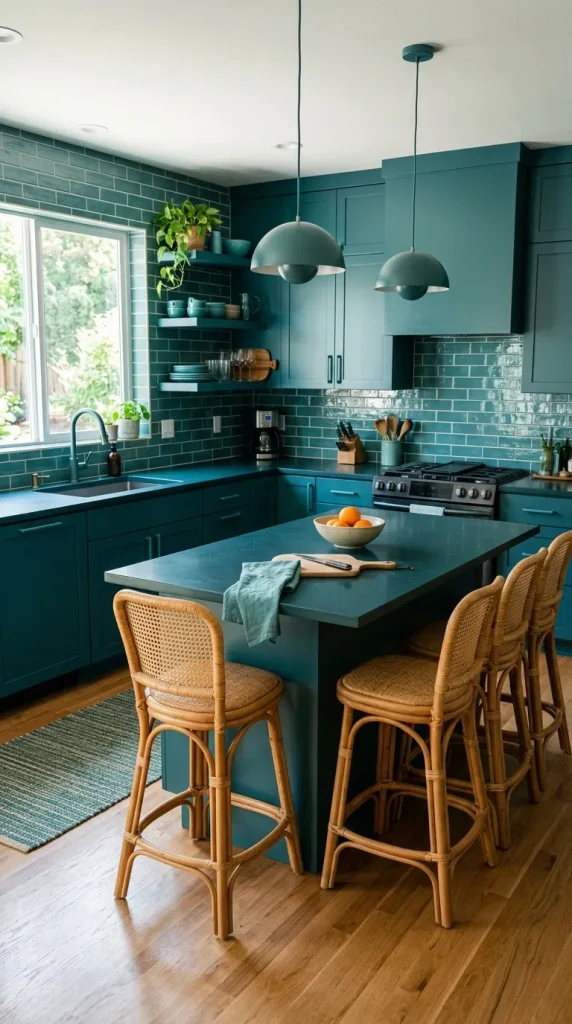
5. Graphic Flooring for Unexpected Drama
Bold kitchens don’t need to be all about walls and cabinets. A graphic floor—chequerboard, encaustic tiles, or a large‑scale geometric pattern—adds personality and anchors the space.
Why it works The floor is a large canvas that can carry pattern without cluttering eye‑level surfaces, making it ideal for small or busy kitchens.
How to implement
- Choose durable, slip‑resistant tiles in a bold pattern for longevity.
- Keep cabinetry and countertops simple to let the floor be the star.
- Use area rugs in front of the sink or stove to add warmth and protect high‑traffic zones.
Styling tips
- Pull accent colors from the floor into small accessories or textiles.
- Use matte finishes on cabinetry to balance the floor’s visual energy.
- Consider underfloor heating for comfort if using tile.
Mood Graphic floors feel playful, vintage‑inspired, and highly Instagrammable—great for creative homeowners.
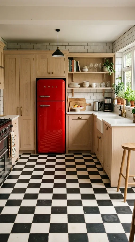
6. Colorful Appliances and Statement Range Hoods
Appliances are no longer limited to stainless steel. A colorful range, retro fridge, or painted hood can become a focal point that defines the kitchen’s personality.
Why it works A single colorful appliance reads like a piece of furniture or art, offering a bold focal point without a full renovation.
How to implement
- Choose a statement range in a saturated enamel finish or a retro‑style fridge in a pop color.
- Paint the range hood in a complementary hue or clad it in patterned tile for extra drama.
- Keep surrounding cabinetry neutral to highlight the appliance.
Styling tips
- Coordinate small appliances (toaster, kettle) in matching or complementary colors.
- Use open shelving near the colorful appliance to display curated items that echo its tone.
- Add metallic trim or knobs to tie the appliance into the overall scheme.
Mood This approach feels fun, nostalgic, and highly personal—perfect for collectors and color lovers.
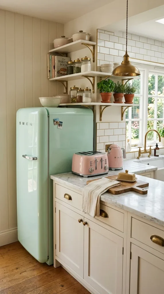
7. High‑Contrast Trim and Molding
Bold kitchens can be refined by using contrasting trim, molding, and ceiling details. Dark trim against light walls—or vice versa—creates architectural interest and frames the kitchen like a gallery.
Why it works Trim and molding are subtle ways to introduce contrast and structure without repainting large surfaces.
How to implement
- Paint window and door trim in a deep color that complements cabinetry.
- Add crown molding or a painted ceiling in a bold hue to draw the eye upward.
- Use contrasting island trim or fluted panels to add texture and depth.
Styling tips
- Keep hardware and fixtures in finishes that harmonize with trim colors.
- Use simple, clean lines in cabinetry to let the trim be the decorative element.
- Add artwork or framed prints that pick up the trim color for cohesion.
Mood This idea feels polished and intentional—bold without being loud.
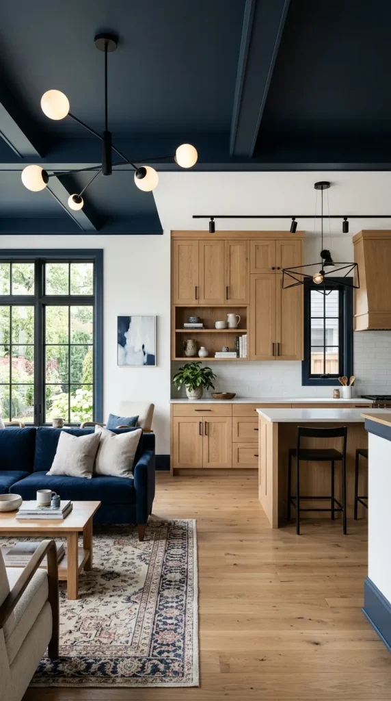
8. Playful Pattern Mixing
Mixing patterns—backsplash tile, patterned wallpaper on an accent wall, and a geometric runner—creates a layered, eclectic kitchen that feels curated and joyful.
Why it works When patterns share a color story, they can coexist harmoniously and add depth and personality.
How to implement
- Choose one dominant pattern and two supporting patterns in smaller scales.
- Keep the color palette consistent across patterns to avoid visual chaos.
- Use solid surfaces (countertops, large cabinets) to give the eye a place to rest.
Styling tips
- Introduce pattern through removable elements—peel‑and‑stick wallpaper, rugs, or curtains—so you can change the look seasonally.
- Use open shelving to display patterned dishware that echoes the room’s motifs.
- Balance busy patterns with natural textures like wood and woven fibers.
Mood Pattern mixing feels adventurous, collected, and endlessly personal—perfect for maximalists and makers.
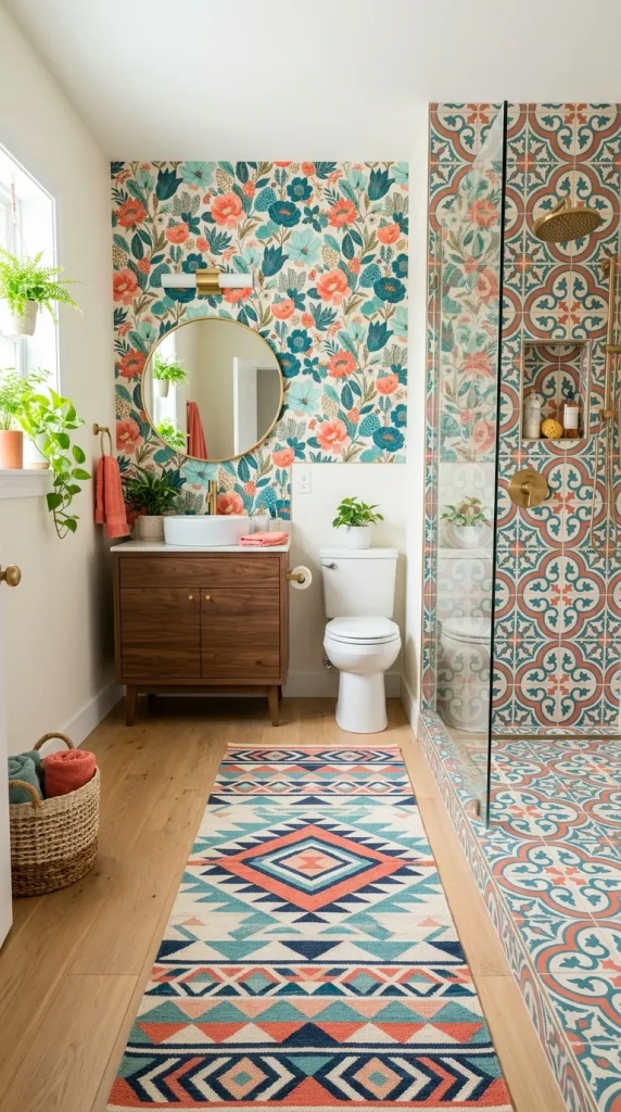
9. Bold Color Framing with Open Shelving
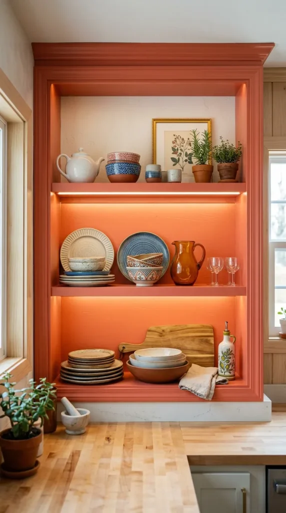
Open shelving painted in a bold color against neutral walls creates framed vignettes that pop. The shelves act like picture frames for your favorite dishes and objects.
Why it works The bold shelf color draws attention to curated displays and adds depth without overwhelming the entire room.
How to implement
- Paint floating shelves or the interior of a recessed shelf in a saturated hue.
- Keep the wall behind the shelves neutral to maximize contrast.
- Arrange dishware and objects by color or material for a gallery‑like effect.
Styling tips
- Use LED strip lighting under shelves to highlight the color and objects.
- Rotate displays seasonally to keep the vignette fresh.
- Add a few sculptural pieces—vases, bowls, or plants—to break up repetitive shapes.
Mood This approach feels artistic and intentional—great for those who love to display collections.
10. Unexpected Color on Ceilings and Appliances
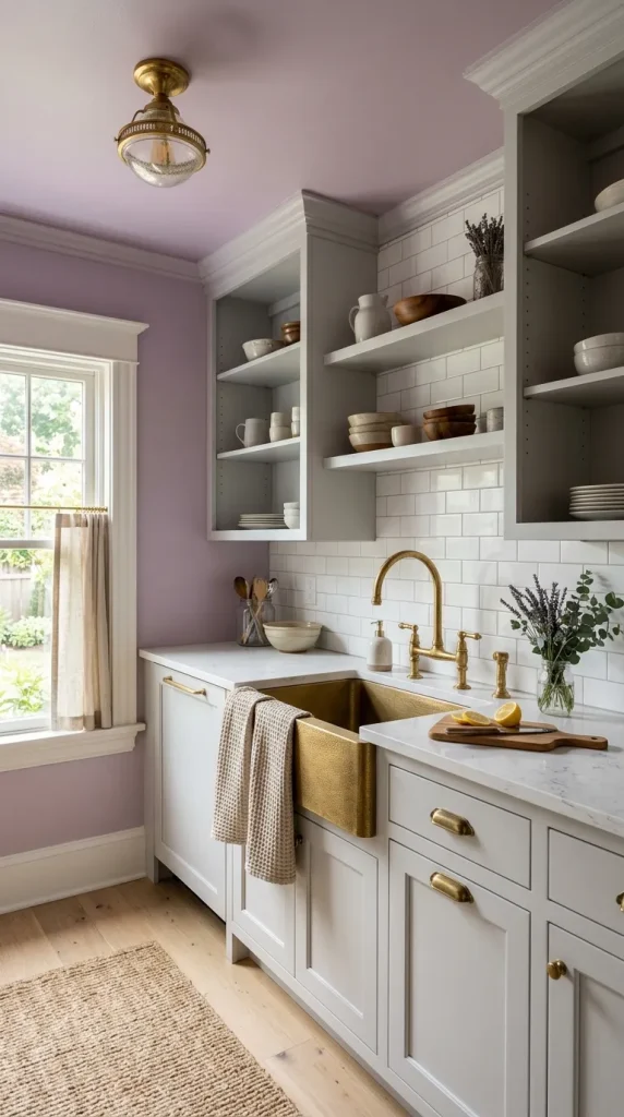
Color on the ceiling or in unexpected places—inside cabinets, on the underside of an island overhang, or on appliance interiors—creates delightful surprises that reward close inspection.
Why it works Surprising color placements add whimsy and depth without committing to large, permanent surfaces.
How to implement
- Paint the ceiling a soft or saturated color that complements cabinetry.
- Use a bright color inside glass‑front cabinets or open shelving for a pop when doors are open.
- Paint the underside of an island overhang or the inside of drawers for a hidden delight.
Styling tips
- Coordinate ceiling color with textiles or small accessories to create cohesion.
- Use durable, washable paint for high‑moisture areas like ceilings above stoves.
- Keep the rest of the palette restrained so the surprise color reads intentional.
Mood Unexpected color placements feel playful, clever, and deeply personal—perfect for design lovers who enjoy small delights.
Pulling It All Together: Practical Tips and Planning
Creating a bright and bold kitchen requires balance. Here’s a practical roadmap to help you plan and execute a vibrant kitchen that feels cohesive and livable.
Start with a color story
- Choose a dominant color, a secondary color, and one or two neutrals.
- Test paint and tile samples in the actual kitchen light before committing.
Anchor with durable surfaces
- Select countertops and flooring that can withstand daily use and complement your color choices.
- Prioritize easy‑clean backsplashes and durable cabinet finishes.
Layer lighting
- Combine ambient, task, and accent lighting to showcase color and texture.
- Use dimmers to shift mood from bright morning prep to cozy evening dinners.
Mix finishes thoughtfully
- Limit metal finishes to two complementary tones (e.g., brass + matte black) to avoid visual clutter.
- Use texture—wood, rattan, stone—to warm saturated colors.
Plan for resale
- If resale is a concern, keep large, expensive elements (flooring, countertops) neutral and introduce boldness through paint, appliances, and removable accents.
Budget wisely
- Splurge on statement pieces (range, island, lighting) and save on accessories and paint.
- Consider painting existing cabinets or using high‑quality vinyl wraps for a budget‑friendly color update.
Final Styling Checklist
- Samples first: test colors in different light.
- Balance: pair bold color with neutral anchors.
- Texture: add wood, woven, and stone elements.
- Lighting: layer and dim for versatility.
- Hardware: choose finishes that complement the palette.
- Accessories: use textiles and dishware to echo colors.
- Maintenance: pick durable, easy‑clean materials.
A bright and bold kitchen is a celebration of personality and design courage. Whether you choose a jewel‑tone cabinet, a graphic floor, or a surprise ceiling color, the key is to be intentional—balance saturated hues with neutrals, layer textures, and let one or two statement elements lead the room. With thoughtful planning, your kitchen can be a joyful, functional, and endlessly photogenic heart of the home.
More ideas to come…