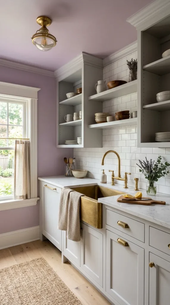
10. Unexpected Color on Ceilings and Appliances
Color on the ceiling or in unexpected places—inside cabinets, on the underside of an island overhang, or on appliance interiors—creates delightful surprises that reward close inspection.
Why it works Surprising color placements add whimsy and depth without committing to large, permanent surfaces.
How to implement
- Paint the ceiling a soft or saturated color that complements cabinetry.
- Use a bright color inside glass‑front cabinets or open shelving for a pop when doors are open.
- Paint the underside of an island overhang or the inside of drawers for a hidden delight.
Styling tips
- Coordinate ceiling color with textiles or small accessories to create cohesion.
- Use durable, washable paint for high‑moisture areas like ceilings above stoves.
- Keep the rest of the palette restrained so the surprise color reads intentional.
Mood Unexpected color placements feel playful, clever, and deeply personal—perfect for design lovers who enjoy small delights.
Pulling It All Together: Practical Tips and Planning
Creating a bright and bold kitchen requires balance. Here’s a practical roadmap to help you plan and execute a vibrant kitchen that feels cohesive and livable.
Start with a color story
- Choose a dominant color, a secondary color, and one or two neutrals.
- Test paint and tile samples in the actual kitchen light before committing.
Anchor with durable surfaces
- Select countertops and flooring that can withstand daily use and complement your color choices.
- Prioritize easy‑clean backsplashes and durable cabinet finishes.
Layer lighting
- Combine ambient, task, and accent lighting to showcase color and texture.
- Use dimmers to shift mood from bright morning prep to cozy evening dinners.
Mix finishes thoughtfully
- Limit metal finishes to two complementary tones (e.g., brass + matte black) to avoid visual clutter.
- Use texture—wood, rattan, stone—to warm saturated colors.
Plan for resale
- If resale is a concern, keep large, expensive elements (flooring, countertops) neutral and introduce boldness through paint, appliances, and removable accents.
Budget wisely
- Splurge on statement pieces (range, island, lighting) and save on accessories and paint.
- Consider painting existing cabinets or using high‑quality vinyl wraps for a budget‑friendly color update.
Final Styling Checklist
- Samples first: test colors in different light.
- Balance: pair bold color with neutral anchors.
- Texture: add wood, woven, and stone elements.
- Lighting: layer and dim for versatility.
- Hardware: choose finishes that complement the palette.
- Accessories: use textiles and dishware to echo colors.
- Maintenance: pick durable, easy‑clean materials.
A bright and bold kitchen is a celebration of personality and design courage. Whether you choose a jewel‑tone cabinet, a graphic floor, or a surprise ceiling color, the key is to be intentional—balance saturated hues with neutrals, layer textures, and let one or two statement elements lead the room. With thoughtful planning, your kitchen can be a joyful, functional, and endlessly photogenic heart of the home.
More ideas to come…